Haus & Garten is a leading brand that gardening professionals, avid gardeners, and homeowners have come to trust.
Total rebranding
More feminine brand (but still an option for men)
Add a human touch
Expand target market & maintain current market
Millennials (ages 30-45)
Strengthen commitment to customer satisfaction and high-quality products
Main Goals
Big Idea
Haus & Garten empowers and equips new and experienced gardeners to successfully cultivate a beautiful physical environment.
Design Execution
Making the brand feel organic, memorable and with a soul. We’re not just selling a product, but we’re people behind a brand who care.


These are the initial creative directions that were presented to the client and were developed with further feedback and reiterations. A good jump start to check in if my vision is aligned to theirs. This is my favorite part of designing: research, moodboards and creating a world for the brand or product.
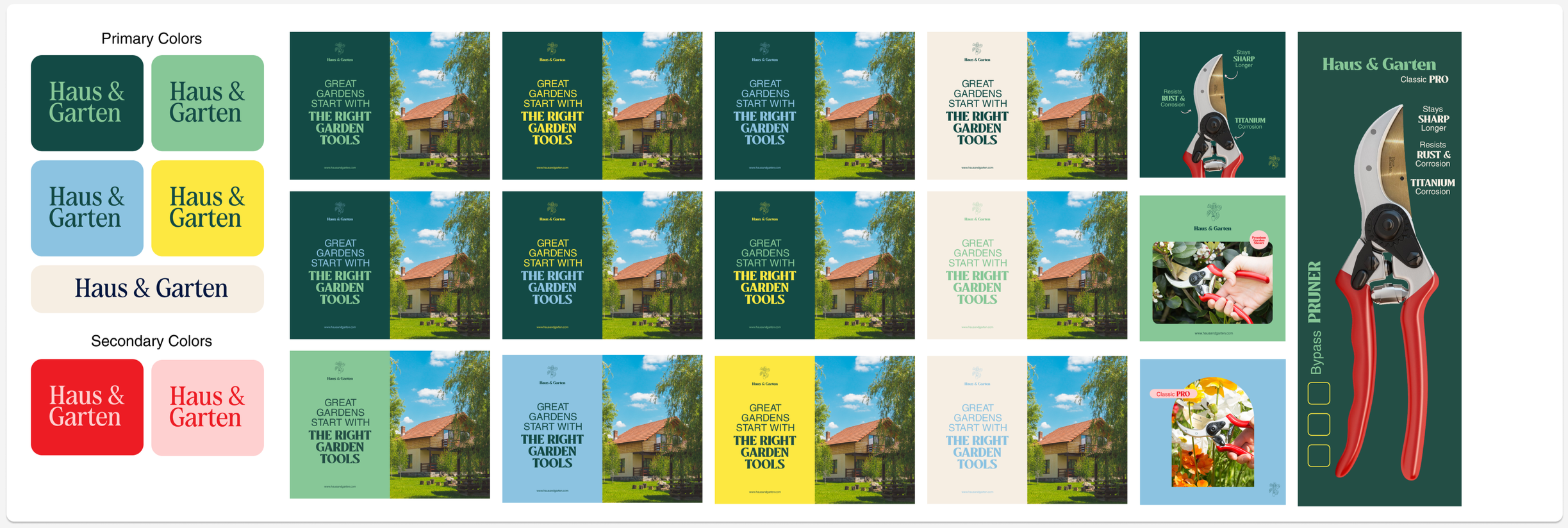
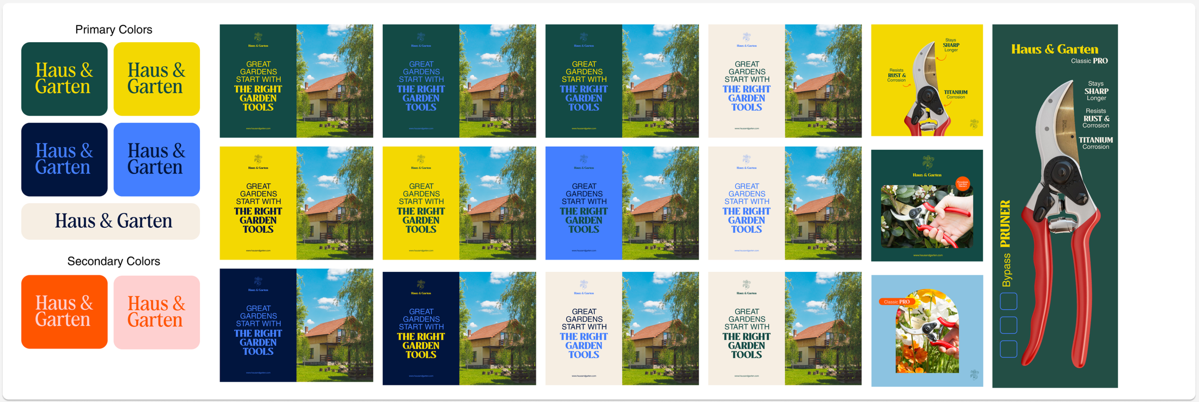
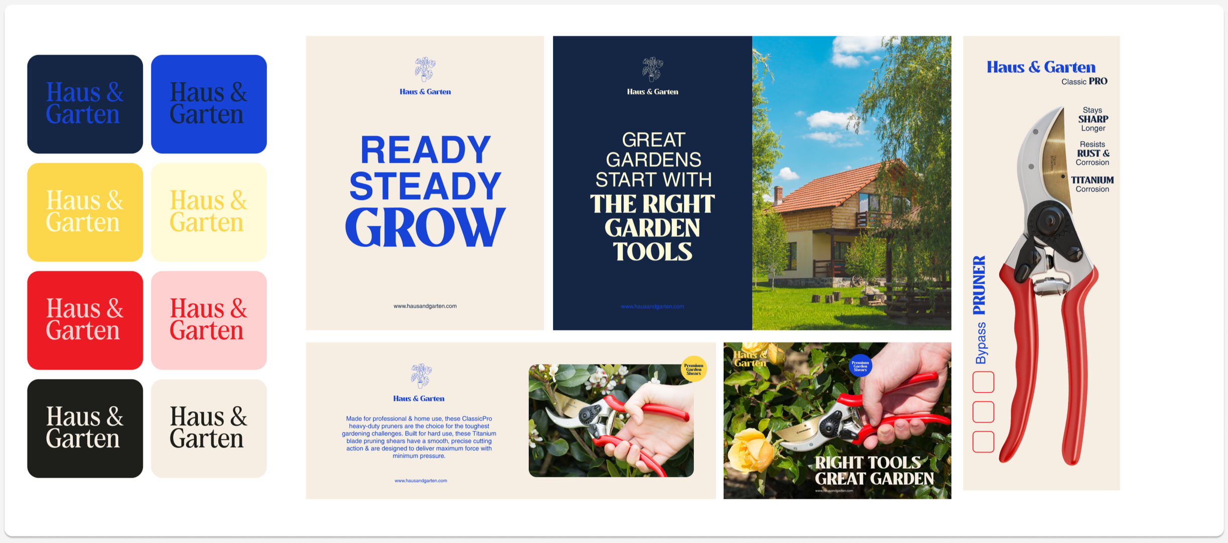
This is the second round of color palette options based on the client’s feedback on the first round. They also gave the complete rundown of all the things they needed for the rebrand, so I had an idea of what I could use as a mockup to better visualize the colors when applied to the brand.
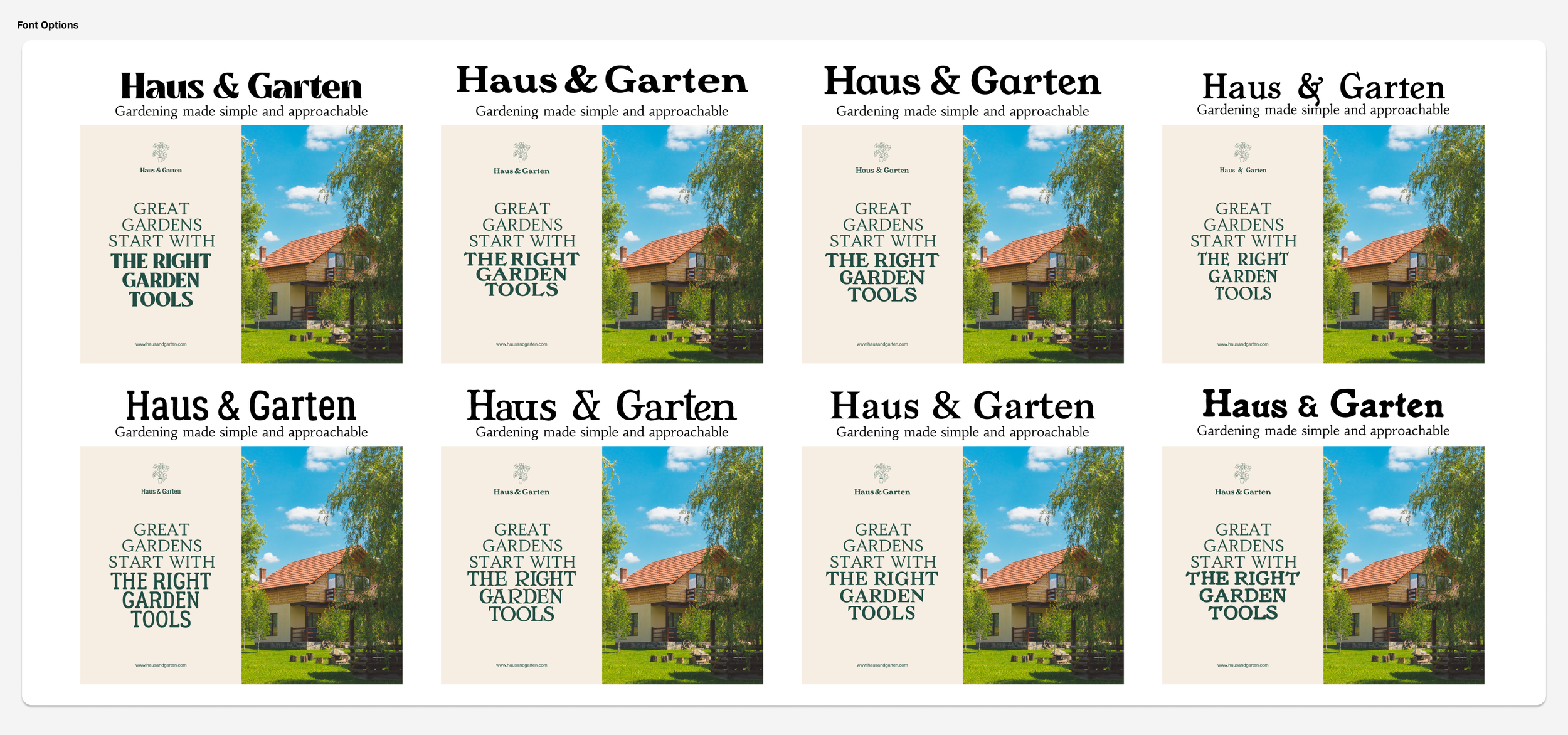

The typography and logo styles were explored next after having a clearer vision of the brand colors.

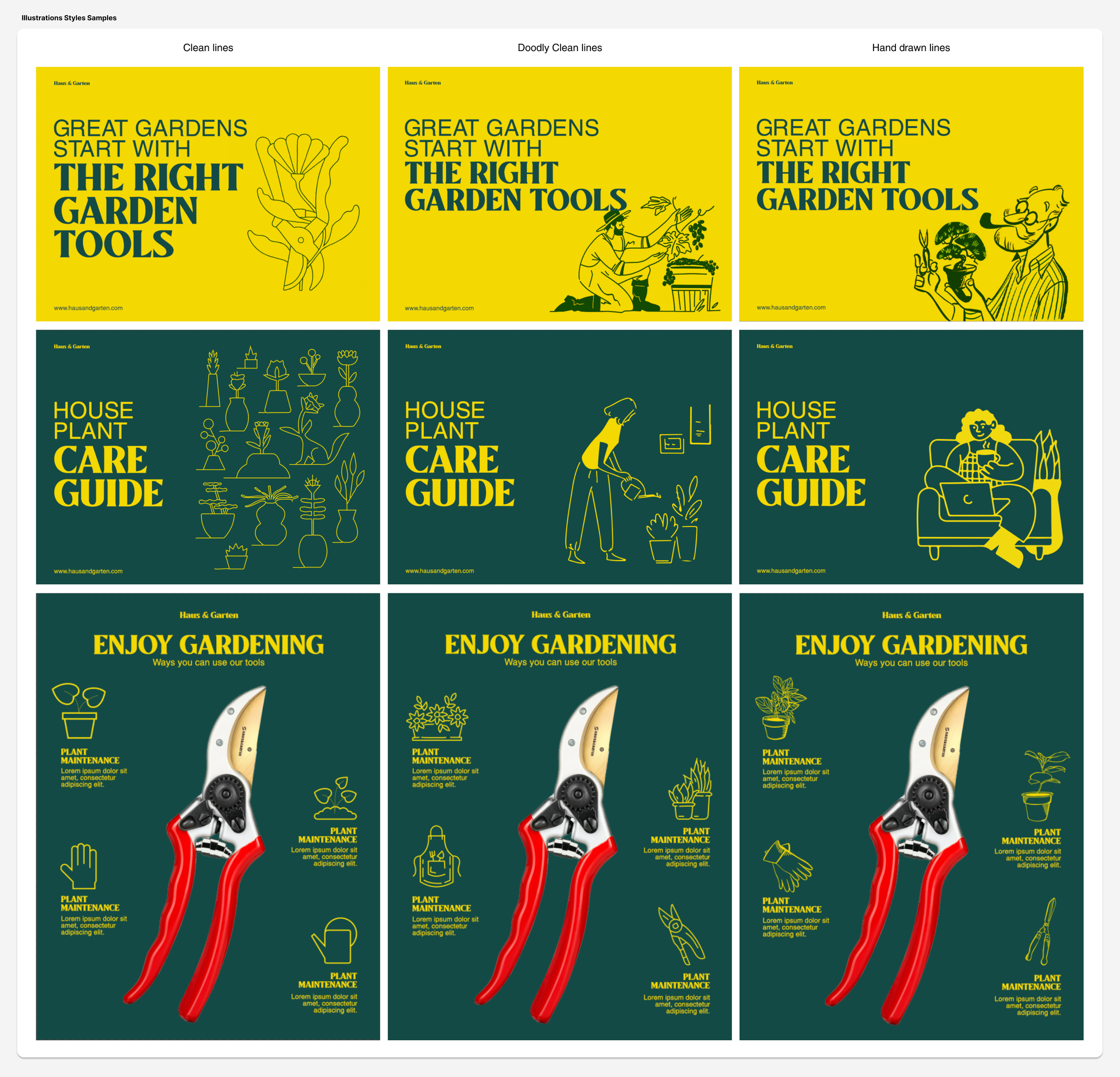
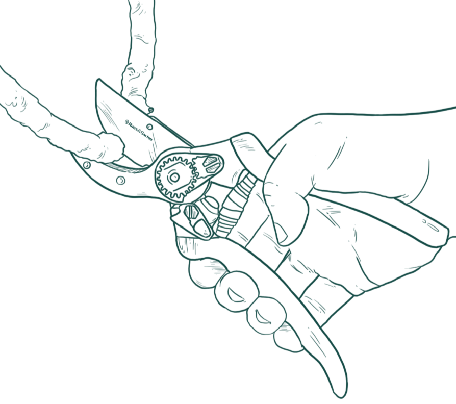

Illustration styles are next with a moodboard and a sample of what it might look like when applied to the brand.
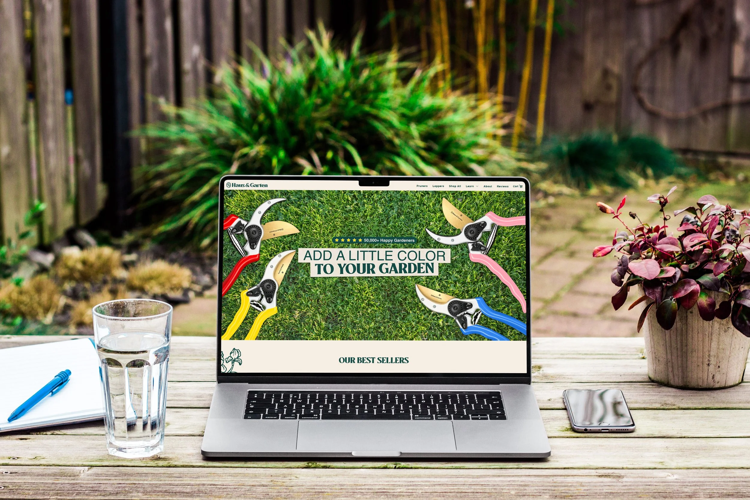
The outcome
This rebrand aimed to connect with both younger and older audiences while giving the brand a warmer, more approachable personality. Vibrant, modern colors were introduced to appeal to a younger demographic, while large, legible typography and a user-friendly website ensured accessibility for existing older demographic customers.
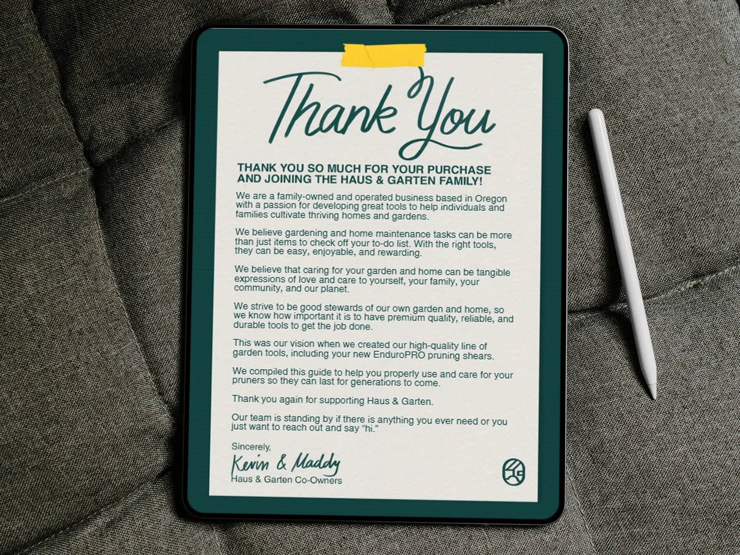
To add “soul” to the brand, we used handwritten letters in product manuals and incorporated crafty paper textures and cutout elements across social media, packaging, the website, and the overall visual identity. These touches created a sense of personal connection—like receiving a family journal or a cookbook from a loved one—positioning the brand as approachable and relatable.
The rebrand goes beyond color, logo and images; it reshapes the entire brand experience, setting it apart from competitors who often feel rigid and overly authoritative.